

Domain-specific widgets as first-class building blocks for the language model.
As soon as domain-specific concepts come into play, A2UI's Basic Catalog rarely suffices: a flight booking, a boarding pass, or a bonus program quickly look arbitrary as generic cards and lists. With Custom Catalogs, A2UI therefore provides a clear mechanism to make your own domain-appropriate components and functions available to the language model – without sacrificing the lean, declarative character of the protocol.
This third and final part of the series shows how to define such Custom Catalogs in Angular, register them with the renderer, and integrate them with the AG-UI abstraction introduced in the second part.
📂 Source Code (see branch a2ui-dynamic)
What Are Custom Catalogs in A2UI?
A Custom Catalog extends A2UI with your own, domain-driven components and functions that the language model may reference like any other component. Custom Catalogs often represent a superset of the Basic Catalog, so that in addition to your own building blocks they also include the well-known general-purpose UI building blocks. From the renderer's perspective, processing remains the same; the LLM merely receives a larger toolbox.
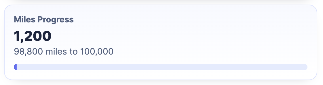
In what follows, we extend the passenger card introduced in the first part with our own MilesProgress component, which visualizes the progress to the next bonus tier:
Creating Your Own Components for the Custom Catalog
At its core, an A2UI component in Angular is just a regular Angular component. However, it receives the inputs that the agent transmits via A2UI through a defined Context object. The following listing shows the definition of such a context for our MilesProgress component. The passenger property is declared as a BoundProperty: it can hold either concrete data or represent a binding to the data model:
export interface MilesProgressContext {
  passenger: BoundProperty<Passenger>;
}
The corresponding component receives this context via the props InputSignal:
@Component({
  selector: 'app-miles-progress',
  changeDetection: ChangeDetectionStrategy.OnPush,
  imports: [DecimalPipe],
  template: `
    <section class="miles-progress">
      <h3>Miles Progress</h3>
      <p class="current">{{ passenger().bonusMiles | number }}</p>
      <p class="remaining">
        {{ remainingMiles() | number }} miles to {{ nextThreshold() | number }}
      </p>
      <div aria-hidden="true" class="track">
        <div class="fill" [style.width.%]="progressPercent()"></div>
      </div>
    </section>
  `,
  styleUrl: './miles-progress.css',
})
export class MilesProgress {
  readonly props = input<MilesProgressContext>(initialContext);
  readonly surfaceId = input.required<string>();
  readonly componentId = input.required<string>();
  readonly dataContextPath = input('/');

  protected readonly passenger = computed(() => this.props().passenger.value());

  protected readonly nextThreshold = computed(() =>
    calcNextThreshold(this.passenger().bonusMiles),
  );

  protected readonly remainingMiles = computed(() =>
    calcRemainingMiles(this.nextThreshold(), this.passenger().bonusMiles),
  );

  protected readonly progressPercent = computed(() =>
    calcProgressPercent(this.nextThreshold(), this.passenger().bonusMiles),
  );
}
The MilesProgress component shown reads the current bonus miles from the context and uses a computed signal to calculate the number of miles still needed to reach the next bonus tier. It also displays a progress indicator for that goal.
So that the renderer knows the MilesProgress component and can instantiate it correctly, a description of its inputs in the form of a schema is also required. The renderer from the A2UI team uses the popular library Zod for this:
import {
  AngularComponentImplementation,
} from '@a2ui/angular/v0_9';
import { z } from 'zod/v3';

[...]

const passengerSchema = z
  .object({
    id: z.number(),
    firstName: z.string(),
    lastName: z.string(),
    bonusMiles: z.number(),
  })
  .strict();

const pathBindingSchema = z.object({ path: z.string() }).strict();

const passengerOrPathSchema = z.union([passengerSchema, pathBindingSchema]);

const milesProgressSchema = z
  .object({
    passenger: passengerOrPathSchema.optional(),
  })
  .strict();

const milesProgressEntry = {
  name: 'MilesProgress',
  component: MilesProgress,
  schema: milesProgressSchema,
} as unknown as AngularComponentImplementation;
// ^^^ unknown prevents typing issue in current version
The schema specifies that the passenger property can be passed either as an object (passengerSchema) or as a data binding (pathBindingSchema) with a path property. The constant milesProgressEntry bundles the component's name and implementation as well as the schema into a single unit that the catalog can later include.
New: Agentic UI with Angular
If you don’t just want to integrate A2UI but embed it into a scalable architecture:
In my book Agentic UI with Angular, I cover the underlying patterns and trade-offs in depth.
Your Own Functions for the Custom Catalog
In addition to components, a Custom Catalog can also provide its own functions. These complement the standard functions included in the Basic Catalog, such as formatNumber and formatDate. The following listing shows a small helper function formatId, which converts a numeric ID into a readable string like P-0042. To describe the expected arguments, Zod is used once again:
import type { FunctionImplementation } from '@a2ui/web_core/v0_9';
import { z, type ZodTypeAny } from 'zod/v3';

const formatIdSchema = z
  .object({
    value: z.number(),
  })
  .strict();

export const formatIdImplementation = {
  name: 'formatId',
  returnType: 'string',
  schema: formatIdSchema as unknown as ZodTypeAny,
  execute: (args: Record<string, unknown>) => {
    const { value } = formatIdSchema.parse(args);
    const normalizedValue = Math.max(0, Math.trunc(value));
    return `P-${String(normalizedValue).padStart(4, '0')}`;
  },
} as unknown as FunctionImplementation;
// ^^^ unknown prevents typing issue in current version
With components and functions, the two central building blocks of a Custom Catalog are defined. As the next step, we need to make the catalog available to the renderer.
Registering a Custom Catalog with the A2UI Renderer
A Custom Catalog inherits from BasicCatalogBase and passes a unique ID, the list of additional components, and a list of functions in the constructor:
@Injectable({ providedIn: 'root' })
export class CustomCatalog extends BasicCatalogBase {
  constructor() {
    super({
      id: 'https://example.com/catalogs/flights42-a2ui-demo',
      extraComponents: [milesProgress],
      functions: [...BASIC_FUNCTIONS, formatIdImplementation],
    });
  }
}
Analogous to the BasicCatalog of the Angular adapter, we also provide our CustomCatalog as an Angular service with providedIn: 'root'. So that the renderer uses the new catalog, it just needs to be referenced in the configuration:
import {
  A2UI_RENDERER_CONFIG,
  A2uiRendererService,
  provideMarkdownRenderer,
} from '@a2ui/angular/v0_9';
import {
  ApplicationConfig,
  inject,
  provideBrowserGlobalErrorListeners,
} from '@angular/core';
import { marked } from 'marked';
import { CustomCatalog } from './custom-catalog/custom-catalog';

export const appConfig: ApplicationConfig = {
  providers: [
    provideBrowserGlobalErrorListeners(),
    {
      provide: A2UI_RENDERER_CONFIG,
      useFactory: () => ({
        catalogs: [inject(CustomCatalog)],
      }),
    },
    provideMarkdownRenderer(async (markdown) =>
      marked.parse(String(markdown ?? '')),
    ),
    A2uiRendererService,
  ],
};
Once the catalog is registered, the example application can use the MilesProgress component like any other component in an A2UI message. The following listing shows an excerpt of an updateComponents message in which the MilesProgress component is displayed alongside the existing passenger card:
updateComponents: {
  surfaceId,
  components: [
    {
      id: 'root',
      component: 'Column',
      children: ['passenger-card', 'miles-progress'],
    },
    [...]
    {
      id: 'miles-progress',
      component: 'MilesProgress',
      passenger: { path: '/passenger' },
    },
  ],
}
Wiring Custom Components into the AG-UI Abstraction
So far we've registered Custom Components for the standalone A2UI renderer. In combination with the AG-UI abstraction introduced in the second part of this series, the approach looks similar but somewhat more convenient: the abstraction provides its own helper functions that encapsulate both the component description and its registration.
So that the A2UI renderer in the sidecar can show not only the components of the Basic Catalog but also your own widgets, Custom Components can be added. The example project used here contains a TicketWidget that represents a boarding pass:
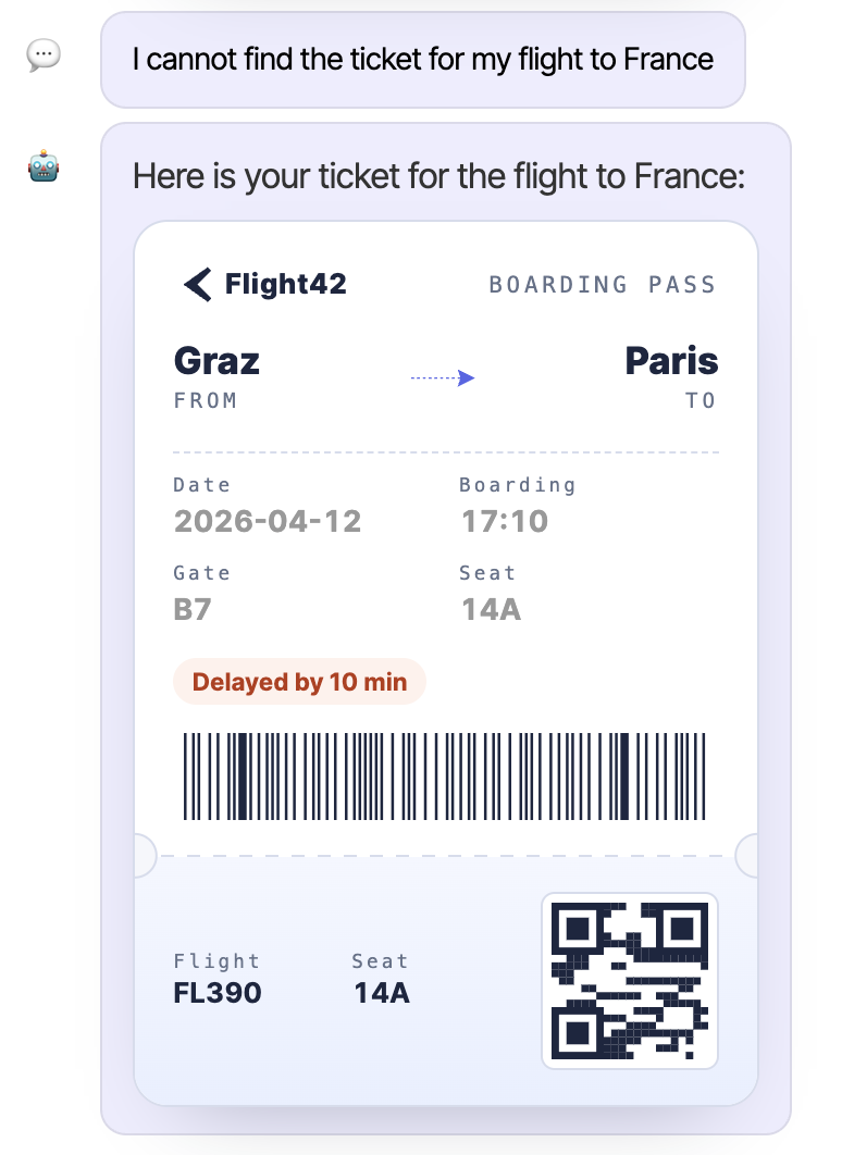
The helper function used here, createCustomComponent, takes the name, the description, the component implementation, and a Zod schema that describes the component's properties:
import {
  A2uiCustomCatalogComponent,
  binding,
  createCustomComponent,
} from '@internal/ag-ui-client';
import { z } from 'zod';
import { TicketWidget } from './ticket/ticket-widget';

export const ticketWidgetEntry = createCustomComponent({
  name: 'TicketWidget',
  description: 'A boarding-pass-style widget ...',
  component: TicketWidget,
  schema: z
    .object({
      ticketId: binding(z.union([z.string(), z.number()])),
      from: binding(z.string()),
      to: binding(z.string()),
      date: binding(z.string()),
      delay: binding(z.number()).optional(),
    })
    .strict(),
});

export const ticketingExtraComponents: A2uiCustomCatalogComponent[] = [
  ticketWidgetEntry,
];
The binding schema represents those fields that the LLM may either set directly or wire to values from the data model via a path binding.
So that a Custom Catalog that extends the Basic Catalog with this component is used, we put the description of our TicketWidget into an array and pass it to provideA2uiCatalog:
import { provideMarkdownRenderer } from '@a2ui/angular/v0_9';
import { provideA2uiCatalog } from '@internal/ag-ui-client';
import { marked } from 'marked';
import { ticketingExtraComponents } from './domains/ticketing/ai/custom-catalog/ticketing-extra-components';

[...]

export const appConfig: ApplicationConfig = {
  providers: [
    [...]
    provideA2uiCatalog({
      id: 'https://angulararchitects.io/custom_catalog.json',
      components: ticketingExtraComponents,
      sendCatalogDescription: true,
    }),
    provideMarkdownRenderer(async (markdown) =>
      marked.parse(String(markdown ?? '')),
    ),
  ],
};
For Custom Functions, provideA2uiCatalog provides a functions property that is not used here. To ensure that the given id is unique, a URL from your own domain is typically used.
Security Aspect: sendCatalogDescription and Prompt Injection
The sendCatalogDescription flag ensures that the textual descriptions of the components are transmitted to the agent so that it can include the component catalog in the prompt for the LLM. The abstraction in the libs folder introduced in the second part derives simple examples from the schema and appends them, together with the descriptions, to the system prompt.
This approach is very convenient for development, but in production it can be abused for prompt injection. In such an attack, an attacker injects malicious instructions into the system prompt and thereby tricks the language model into performing unintended actions.
Therefore, in production it is advisable to set the sendCatalogDescription flag to false. As a result, the client only transmits the catalog id. The agent validates this against a list of approved catalogs and obtains the corresponding schema from a trusted registry – for example, via an internal API or database.
Summary
Custom Catalogs extend A2UI in a targeted way with your own components and functions that the language model may use like any other building block. This makes it possible to translate generic responses into domain-appropriate interfaces without losing the character of a lean, declarative protocol. Schema validation via Zod ensures clean contracts between agent and client, while the split into components and functions keeps the catalog flexible.
In combination with the AG-UI abstraction, Custom Components can be described compactly with createCustomComponent and registered through a single provider call. Anyone planning the move to production should also consider the security aspect around sendCatalogDescription and source catalog schemas from a trusted source.
Anyone who combines protocol, renderer, AG-UI integration, and Custom Catalogs has a solid foundation to have language models deliver not just text but real UI responses – and in a way that fits their own application.
FAQ
What is a Custom Catalog in A2UI?
A Custom Catalog extends A2UI with your own, domain-driven components and functions. It often includes the Basic Catalog as a superset and additionally provides domain-specific building blocks to the language model, which the renderer processes like any other A2UI component.
How do you describe your own A2UI component?
The implementation is a regular Angular component that receives its inputs via a Context object. In addition to the component itself, a Zod schema is defined that describes the expected properties. Component, name, and schema are added together as an entry in the Custom Catalog.
How do you register a Custom Catalog in Angular?
The Custom Catalog is provided as a service with providedIn: 'root' and referenced in the A2UI_RENDERER_CONFIG token. In the AG-UI abstraction, this is handled by the provideA2uiCatalog function, to which components and optional functions can be passed directly.
What is sendCatalogDescription for and when should you disable the flag?
sendCatalogDescription transmits the textual component descriptions to the agent, which embeds them into the system prompt. This is very convenient, but can lead to prompt injection. In production, it is therefore advisable to set the flag to false and load schemas server-side from a trusted registry.