

Signals will shape Angular's future. However, the Signals concept itself is just one part of the overall story. We also need a way to communicate with (sub)components via Signals. Angular 17.1 brought Input Signals, and with Angular 17.2 we've got Signal-based Two-way Bindings and support for content and view queries. To align with Input Signals, Version 17.3 provides a new output API.
In this article, I show how to use these new possibilities.
📁 Source Code (see different branches)
Big thanks to Angular's Alex Rickabaugh for an enlightening discussion about an idiomatic usage of Signals and to my awesome colleague Michael Egger-Zikes for providing valuable feedback.
Input Signals
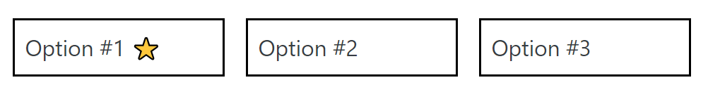
Inputs Signals allow us to receive data via Property Bindings in the form of Signals. For describing the usage of Signal Inputs, I'm using a simple OptionComponent representing a -- for the sake of simplicity -- non-selectable option. Here, three of them are presented:
Defining an Input Signal
Input Signals are the counterpart to the traditional @Input decorator:
@Component({
  selector: 'app-option',
  standalone: true,
  imports: [],
  template: `
    <div class="option">
      {{ label() }}
    </div>
  `,
  styles: [...]
})
export class OptionComponent {
  label = input.required<string>();
}
This input function is picked up by the Angular Compiler, emitting source code for property bindings. Hence, we should only use it together with properties. The other communication concepts discussed here also use this technique.
Having a function instead of a decorator allows to inform TypeScript about the proper type and whether it includes undefined. In the example shown before, label becomes an InputSignal<string> -- an Input Signal providing a string. An undefined value is not possible as input.required defines a mandatory property.
An InputSignal is always read-only and can be used like a Signal. The template above, for instance, requests its current value by calling the getter (label()).
Binding to an Input Signal
In the case of our InputSignal<string>, the caller has to pass a string:
<app-option label="Option #1">
<app-option [label]="myStringProperty">
If this string comes from a Signal, we have to read it in the template:
<app-option [label]="mySignalProperty()">Computed Signals and Effects as a Replacement for Life Cycle Hooks
All changes to the passed Signal will be reflected by the InputSignal in the component. Internally, both Signals are connected via the graph Angular is maintaining. Life cycle hooks like ngOnInit and ngOnChanges can now be replaced with computed and effect:
markDownTitle = computed(() => '# ' + this.label())

constructor() {
  effect(() => {
    console.log('label updated', this.label());
    console.log('markdown', this.markDownTitle());
  });
}
Options for Input Signals
Here are some further options for setting up an InputSignal:
| Source Code | Description |
|---|---|
| label = input | Optional property represented by an InputSignal<string | undefined> |
| label = input('Hello'); | Optional property represented by an InputSignal<string> with an initial value of Hello |
| label = input<string | undefined>('Hello'); | Optional property represented by an InputSignal<string\| undefined> with an initial value of Hello |
Required Inputs Cannot Have a Default Value!
By definition, input.required cannot have a default value. This makes sense at first glance, however, there is a pitfall: If you try to read the value of a required input before it's been bound, Angular throws an exception.
Hence, you cannot directly access it in the constructor. Instead, you can use ngOnInit or ngOnChanges. Also, using inputs within computed or effect is always safe, as they are only first triggered when the component has been initialized:
@Component([...])
export class OptionComponent implements OnInit, OnChanges {
  label = input.required<string>();

  // safe
  markDownTitle = computed(() => '# ' + this.label())

  constructor() {
    // this would cause an exception,
    // as data hasn't been bound so far
    console.log('label', this.label);

    effect(() => {
        // safe
        console.log('label', this.label);
    })
  }

  ngOnInit() {
    // safe
    console.log('label', this.label);
  }

  ngOnChanges() {
    // safe
    console.log('label', this.label);
  }
}
Aliases for Input Signals
Both input and input.require also take a parameter object that allows the definition of an alias:
label = input.required({ alias: "title" });In this case, the caller needs to bind to the property name defined by the alias:
<app-option title="Option #1">
  <app-option [title]="myStringProperty">
    <app-option [title]="mySignalProperty()"></app-option></app-option
></app-option>
In most cases, you should prevent the usage of aliases, as they create an unnecessary indirection. An often-seen exception to this rule is renaming one of a Directive's properties to match the configured attribute selector.
Transformer for Input Signals
Transformer have already been available for traditional @Inputs. They allow the transformation of a value passed via a property binding. In the following case, the transformer booleanAttribute that can be found in angular/core is used:
@Component({
  selector: 'app-option',
  standalone: true,
  imports: [],
  template: `
    <div class="option">
      {{ label() }} @if (featured()) { ⭐ }
    </div>
  `,
  styles: [...]
})
export class OptionComponent {
  label = input.required<string>();
  featured = input.required({
    transform: booleanAttribute
  })
}
This transformer converts strings to booleans:
<app-option label="Option #1" featured="true"></app-option>Also, if the attribute is present but no value was assigned, true is assumed:
<app-option label="Option #1" featured></app-option>This Signal's type is InputSignal<boolean, unknown>. The first type parameter (boolean) represents the value received from the transformer; the second one (unknown) is the value bound in the caller's template and passed to the transformer. Besides booleanAttribute, @angular/core also provides a numberAttribute transformer that converts passed strings to numbers.
If you want to implement a custom transformer, just provide a function taking the bound value and returning the value that should be used by the called component:
function boolTranformer(value: unknown): boolean {
  return value !== "no";
}
Then, register this function in your input:
@Component([...])
export class OptionComponent {
  label = input.required<string>();
  featured = input.required({
    transform: boolTranformer
  })
}
Two-Way Data Binding with Model Signals
Input Signals are read-only. If you want to pass a Signal that can be updated by the called component, you need to set up a so-called Model Signal. To demonstrate this, I'm using a simple TabbedPaneComponent:
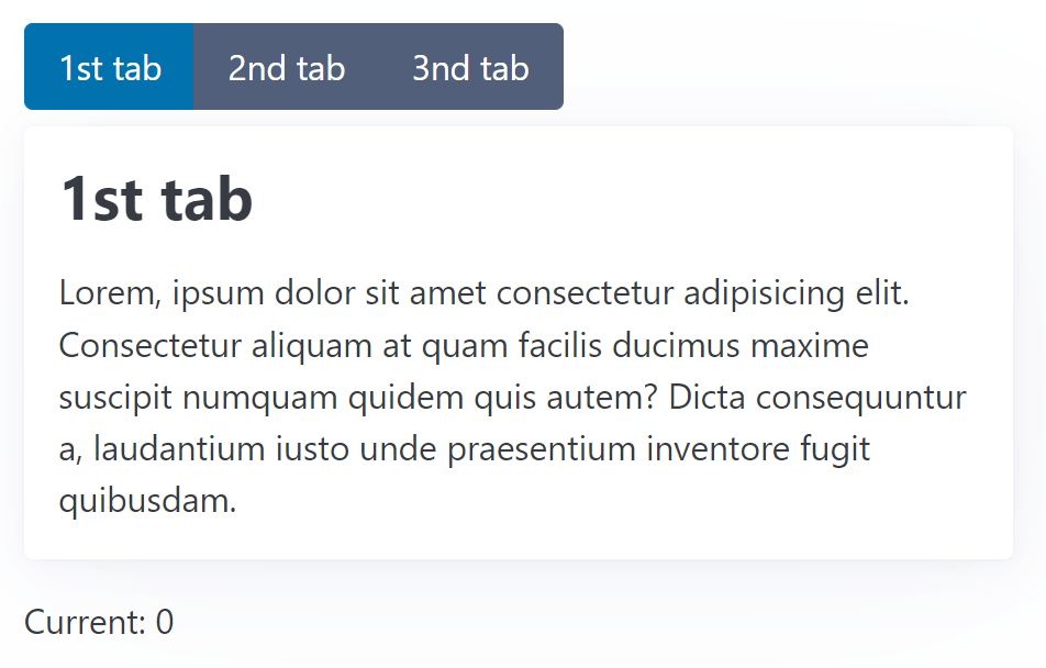
This is how the consumer can use this component:
<app-tabbed-pane [(current)]="current">
  <app-tab title="1st tab"> Lorem, ipsum dolor sit amet ... </app-tab>
  <app-tab title="2nd tab"> Sammas ergo gemma, ipsum dolor ... </app-tab>
  <app-tab title="3nd tab"> Gemma ham ipsum dolor sit ... </app-tab>
</app-tabbed-pane>

<p class="current-info">Current: {{ current() }}</p>
It gets several TabComponents passed. Also, a Signal current is bound via a Two-way Binding. For allowing this, the TabbedPaneComponent needs to provide a Model Signal using model:
@Component([...])
export class TabbedPaneComponent {
  current = model(0);
  [...]
}
Here, 0 is the initial value. The options are similar to the ones for input: model.required defines a mandatory property, and you can provide an alias via an options object. However, a transformer can not be defined.
If this component updates the Model Signal, the new value is propagated up to the the Signal bound in the template:
current.set(1);Two-Way Data Binding as Combination of Input and Output
As usual in Angular, also Signal-based Two-way Bindings can be defined with a (read-only) Input and a respective Output. The Output's name must be the Input's name with the suffix Change. Hence, for current we need to define currentChange:
@Component([...])
export class TabbedPaneComponent {
  current = input(0);
  currentChange = output<number>();
}
For setting up an Output, we the new output API is used. For triggering an event, the application has to call the output's emit method:
<button [...] (click)="currentChange.emit($index)">{{tab.title()}}</button>Content Queries with Signals
The TabbedPaneComponent introduced in the previous section also allows us to showcase another option: Content Queries that get hold of projected Components or Directives.
As shown above, a TabbedPaneComponent gets several TabComponents passed. They are projected into the TabbedPaneComponent's view. However, we only want to display one of them at a given time. Hence, the TabbedPaneComponent needs to get programmatic access to its TabComponents. This can be done with the new contentChildren function:
@Component({
  selector: 'app-tabbed-pane',
  standalone: true,
  imports: [],
  template: `
    <div class="pane">
      <div class="nav" role="group">
        @for(tab of tabs(); track tab) {
        <button
            [class.secondary]="tab !== currentTab()"
            (click)="activate($index)">
                {{tab.title()}}
        </button>
        }
      </div>
      <article>
        <ng-content></ng-content>
      </article>
    </div>
  `,
  styles: [...]
})
export class TabbedPaneComponent {
  current = model(0);
  tabs = contentChildren(TabComponent);
  currentTab = computed(() => this.tabs()[this.current()]);

  activate(active: number): void {
    this.current.set(active);
  }
}
The function contentChildren is the counterpart to the traditional @ContentChildren decorator. As TabComponent was passed as a so-called locator, it returns a Signal with an Array holding all projected TabComponents.
Having the projected nodes as a Signal allows us to project them using computed reactively. The shown example uses this option to derive a Signal currentTab.
The projected TabComponent uses this Signal to find out whether it should be visible:
@Component({
  selector: "app-tab",
  standalone: true,
  imports: [],
  template: `
    @if(visible()) {
    <div class="tab">
      <h2>{{ title() }}</h2>
      <ng-content></ng-content>
    </div>
    }
  `,
})
export class TabComponent {
  pane = inject(TabbedPaneComponent);

  title = input.required<string>();

  visible = computed(() => this.pane.currentTab() === this);
}
For this, we need to know that we can get all parents located in the DOM via dependency injection. The visible Signal is derived from the currentTab Signal.
This procedure is usual in the reactive world: Instead of imperatively setting values, they are declaratively derived from other values.
Content Queries for Descendants
By default, a Content Query only unveils direct content children. "Grandchildren", like the 3rd tab below, are ignored:
<app-tabbed-pane [(current)]="current">
  <app-tab title="1st tab"> Lorem, ipsum dolor sit amet ... </app-tab>
  <app-tab title="2nd tab"> Sammas ergo gemma, ipsum dolor ... </app-tab>

  <div class="danger-zone">
    <app-tab title="3nd tab">
      Here, you can delete the whole internet!
    </app-tab>
  </div>
</app-tabbed-pane>
To also get hold of such nodes, we can set the option descendants to true:
tabs = contentChildren(TabComponent, { descendants: true });Output API
For the sake of API symmetricity, Angular 17.3 introduced a new output API. As already shown before, an output function is now used for defining an event provided by a component. Similar to the new input API, the Angular Compiler picks up the call to the output and emits respective code. The returned OutputEmitterRef's emit method is used to trigger the event:
@Component([...])
export class TabbedPaneComponent {
  current = model(0);
  tabs = contentChildren(TabComponent);
  currentTab = computed(() => this.tabs()[this.current()]);

  tabActivated = output<TabActivatedEvent>();

  activate(active: number): void {
    const previous = this.current();
    this.current.set(active);
    this.tabActivated.emit({ previous, active });
  }
}
Providing Observables as Outputs
Besides this simple way of setting up outputs, you can use an Observable as the source for an output. For this, you find a function outputFromObservable in the RxJS interop layer:
import {
    outputFromObservable,
    toObservable
} from '@angular/core/rxjs-interop';
[...]

@Component([...])
export class TabbedPaneComponent {
  current = model(0);
  tabs = contentChildren(TabComponent);
  currentTab = computed(() => this.tabs()[this.current()]);

  tabChanged$ = toObservable(this.current).pipe(
    scan(
      (acc, active) => ({ active, previous: acc.active }),
      { active: -1, previous: -1 }
    ),
    skip(1),
  );

  tabChanged = outputFromObservable(this.tabChanged$);

  activate(active: number): void {
    this.current.set(active);
  }

}
The function outputFromObservable converts an Observable to an OutputEmitterRef. In the shown example, the scan operator remembers the previous activated tab and skip ensures that no event is emitted when initially setting current. The latter one provides feature parity with the before-shown example.
View Queries with Signals
While a Content Query returns projected nodes, a View Query returns nodes from its own view. These are nodes found in the template of the respective component. In most cases, using data binding instead is the preferable solution. However, getting programmatic access to a view child is needed in some situations.
To demonstrate how to query view children, I use a simple form for setting a username and a password:
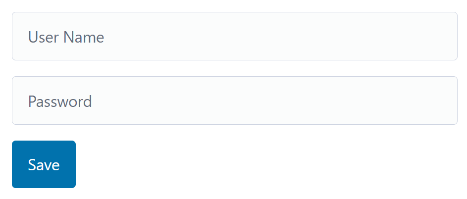
Both input fields are marked as required. If the validation fails when pressing Save, the first field with a validation error should get the focus. For this, we need access to the NgForm directive the FormModule adds to our form tag as well as to the DOM nodes representing the input fields:
@Component({
  selector: "app-form",
  standalone: true,
  imports: [FormsModule, JsonPipe],
  template: `
    <h1>Form Demo</h1>
    <form autocomplete="off">
      <input
        [(ngModel)]="userName"
        placeholder="User Name"
        name="userName"
        #userNameCtrl
        required
      />
      <input
        [(ngModel)]="password"
        placeholder="Password"
        type="password"
        name="password"
        #passwordCtrl
        required
      />
      <button (click)="save()">Save</button>
    </form>
  `,
  styles: `
    form {
      max-width: 600px;
    }
  `,
})
export class FormDemoComponent {
  form = viewChild.required(NgForm);

  userNameCtrl =
    viewChild.required<ElementRef<HTMLInputElement>>("userNameCtrl");
  passwordCtrl =
    viewChild.required<ElementRef<HTMLInputElement>>("passwordCtrl");

  userName = signal("");
  password = signal("");

  save(): void {
    const form = this.form();

    if (form.controls["userName"].invalid) {
      this.userNameCtrl().nativeElement.focus();
      return;
    }

    if (form.controls["password"].invalid) {
      this.passwordCtrl().nativeElement.focus();
      return;
    }

    console.log("save", this.userName(), this.password());
  }
}
Both are done using the viewChild function. In the first case, the example passes the type NgForm as the locator. However, just locating the fields with a type does not work, as there might be several children with this type. For this reason, the inputs are marked with handles (#userName and #password), and the respective handle's name is passed the locator.
View children can be represented by different types: The type of the respective Component or Directive, an ElementRef representing its DOM node, or a ViewContainerRef. The latter one is used in the next section.
The desired type can be mentioned using the read option used in the previous example.
Queries and ViewContainerRef
There are situations where you need to dynamically add a component to a placeholder. Examples are modal dialogs or toasts. An easy way to achieve this is using the *ngComponentOutlet directive. A more flexible way is querying the ViewContainerRef of the placeholder.
You can think about a View Container as an invisible container around each Component and piece of static HTML. After getting hold of it, you can add further Components or Templates.
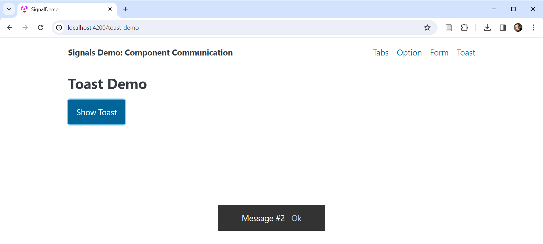
To demonstrate this, I'm using a simple example showing a toast:
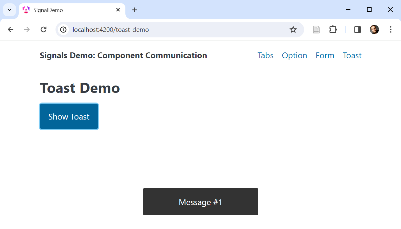
The example uses an ng-container as a placeholder:
@Component({
  selector: 'app-dynamic',
  standalone: true,
  imports: [],
  template: `
    <h2>Toast Demo</h2>
    <button (click)="show()">Show Toast</button>
    <ng-container #placeholder></ng-container>
  `,
  styles: [...]
})
export class ToastDemoComponent {
  counter = 0;
  placeholder = viewChild.required('placeholder', { read: ViewContainerRef });

  show() {
    const ref = this.placeholder().createComponent(ToastComponent);
    this.counter++;
    ref?.setInput('label', 'Message #' + this.counter);
    setTimeout(() => ref?.destroy(), 2000);
  }

}
The read property makes clear that we don't want to read the placeholder component but it's ViewContainerRef. The createComponent method instantiates and adds a ToastComponent. The returned ComponentRef is used to set the new component's label property. For this, its setInput method is used. After two seconds, the destroy method removes the toast again.
For the sake of simplicity, the component ToastComponent was hard-coded here. In more generic real-world scenarios, the component to use can be configured, e.g., by calling a service method, taking the Component type, and notifying another Component that adds a Component of this type to a placeholder.
Programmatically Setting up an Output
The previous example called setInput for assigning a value to the ToastComponent's title
Let's assume, the ToastComponent shows a confirmation link:
When clicking this link, it emits an confirmed event:
@Component([...])
export class ToastComponent {
  label = input.required<string>();
  confirmed = output<string>();

  confirm(): void {
    this.confirmed.emit(this.label());
  }
}
To set up an handler for this event, we can directly use the returned ComponentRef's instance
@Component([...])
export class ToastDemoComponent {
  counter = 0;
  placeholder = viewChild.required('placeholder', { read: ViewContainerRef });

  show() {
    const ref = this.placeholder()?.createComponent(ToastComponent);
    this.counter++;
    const title = 'Message #' + this.counter;
    ref.setInput('label', title);

    // Event handler for confirm output
    ref.instance.confirmed.subscribe(title => {
      ref?.destroy();
      console.log('confirmed', title);
    });

    setTimeout(() => ref?.destroy(), 5000);
  }

}
The OutputEmitterRef's subscribe method allows to define an event handler. In our case, it just removes the toast using destroy and logs the received string to the console.
However, this example comes with a small beauty mistake. Regardless whether the user clicks the confirmation link or not, the example calls destroy after 5 seconds. Hence, the toast might be removed twice: Once after the confirmation and another time after displaying it for 5 seconds.
Fortunately, destroying a component twice does not result in an error. To solve this, we could introduce a destroyed flag . The next section shows a more powerful approach: Consuming outputs as Observables.
Consuming Outputs as Observables
Even though the OutputEmitterRef provides a subscribe method, it is not an Observable. However, the original EventEmitter used together with the @Output decorator was. To get back all the possibilities associated with Observable-based outputs, you can use the function outputToObservable that is part of the RxJS interop layer:
import { outputToObservable } from '@angular/core/rxjs-interop';
[...]

@Component([...])
export class ToastDemoComponent {
  counter = 0;
  placeholder = viewChild.required('placeholder', { read: ViewContainerRef });

  show() {
    const ref = this.placeholder()?.createComponent(ToastComponent);
    this.counter++;
    const title = 'Message #' + this.counter;
    ref.setInput('label', title);

    const confirmed$ = outputToObservable(ref.instance.confirmed)
      .pipe(map(title => ({ trigger: 'confirmed', title })));

    const timer$ = timer(5000);
      .pipe(map(() => ({ trigger: 'timeout', title })));

    race(confirmed$, timer$).subscribe(action => {
      ref?.destroy();
      console.log('action', action);
    });

  }

}
The function outputToObservable converts an OutputEmitterRef to an Observable. The shown example uses it to express both, the confirm event and the 5 sec timeout as observable. The race operator ensures that only the Observable that first issues a value is used.
The Observable returned by outputToObservable completes when Angular destroys the the output's component. For this reason, there is no need to unsubscribe by hand.
Feature Parity between Content and View Queries
So far, we have worked with contentChildren to query several projected children and viewChild to get hold of one node in the view. However, both concepts have feature parity: For instance, there is also a contentChild and a viewChildren function.
Also, all the options we've used above for View or Content Queries, like using handles as locators or using the read property, work for both kinds of queries.
Conclusion
Several new functions replace property decorators and help to set up data binding concepts. These functions are picked up by the Angular compiler emitting respective code.
The function input defines Inputs for property bindings, model defines Inputs for Two Way Data Binding, and contentChild(ren) and viewChild(ren) take care of Content and View Queries. Using these functions results in Signals that can be projected with computed and used within effects.